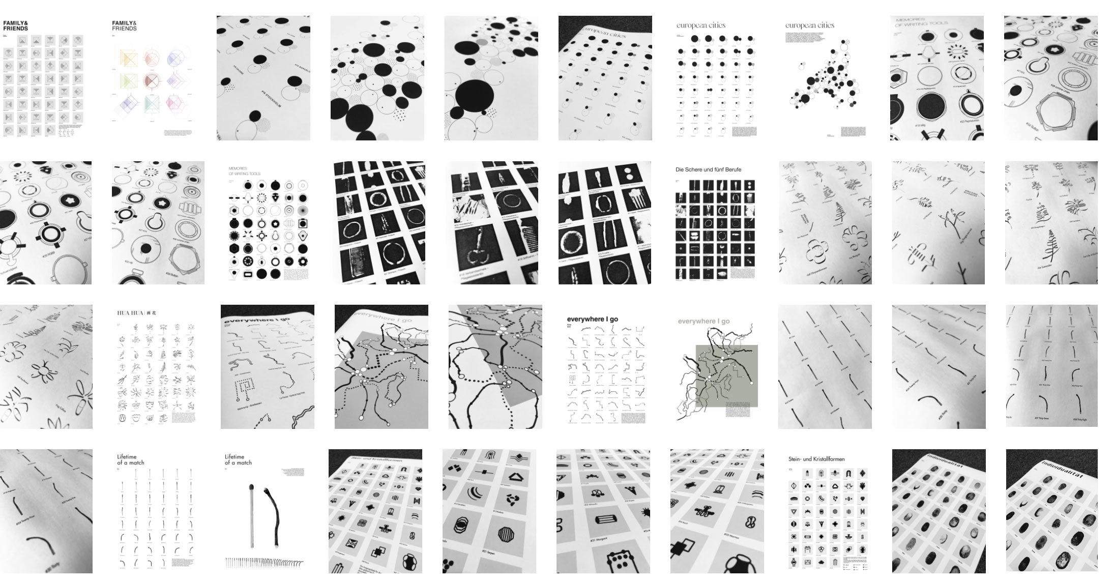
Student work developed in the course “Introduction to Information Design I” at the New Design University in Austria, taught by Olivier Arcioli. Signs and Symbols are an essential part of information design and visual communication as they allow intuitive and quick access to information. New Design University students start their research process with an everyday object to translate knowledge into visual systems.
The students start the project by observing their surroundings and find a “simple” and “banal” everyday object. What is happening on the floor? What kind of objects do you encounter on your forays through the city – while jogging, on the way to the supermarket, at the bus stop or in front of a door, on your desk or under your bed, in the basement or attic? A coin, a leaf, a rice grain, a subway ticket, a pushpin, a eraser, a stone, a match…
What is the story behind this object and how can the whole universe of information and associations condense in one single object, look like in a visual set of 45 symbols?
For the development of the very individual signs and symbols, traces, notations, letters, graphic forms, photographs, drawings, illustrations could be used as visual material.
Student Statements
Nicole Arthaber
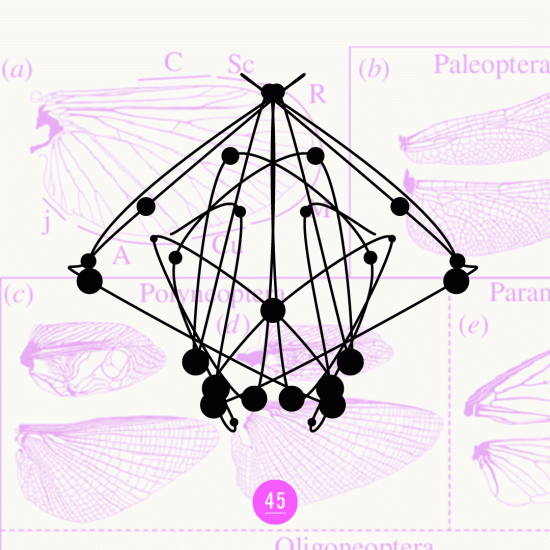
TOP 45 most valuable brands 2020
Parting from a Shopping venture coin, this character set represent the TOP 45 most valuable brands of 2020. All characters follow a certain system, which gives the possibility to expand this symbol set endlessly. The symbols are visual representations of the value in numbers of each brand. Each vertical line is associated with a digit (1-9+0), each diagonal line is the connection between two digits and can be read from left to right. If a digit appears twice or three times in the value, then the line was depicted accordingly often.
Daniel Eisele
One part, many possibilities
The chosen object is a so-called “keyhole hanger”. These metal plates are available in different shapes and sizes to match objects together or to hang them up. The goal of my project with these technical looking symbols is to stimulate the imagination and to evoke free associations.
Carina Eglhofer
FAMILY & FRIENDS
A family photo is the starting point of the investigation. In this project, I use simple shapes to represent some of the physical characteristics, the time of the first meeting, and the location of my family and friends.
Naomi Hinkelmann
european cities
I chose a pushpin, which led me thinking of a world map and further to the different cities in the european union. This collection of 45 symbols shows the 45 biggest cities in the EU, sorted by population. Each graphic represents three different topics: size of the population (black point), the population density (point on the right side with many smaller dots inside) and the approximate location of the city in Europe is demonstrated by the small dot in the circle.
Jaehyeok Jang
MEMORIES OF WRITING TOOLS
These 45 symbols show the shapes of different writing tools, seen from the top side. With all these pens I have written until today. We already know that objects can be used to remember something. With these shapes I can remember what I was thinking when I was working with these pens. Every single object can evoke memories in us.
Melanie Karl
The scissors in five professions
My project is about the five jobs in my family. The idea came from a related tool – the scissors. My mother works as a nurse, my sister is an administrative assistant and I am a hairdresser. My father works as a measurement technician and my brother as an automotive technician. All of these jobs have in common that they use scissors in combination with other tools every day. Each profession is represented by imprints of specific work tools.
Yu Qi Lin
HUA HUA 画 花
Definition: HUA, is the pinyin writing method for both chinese characters „flower“ and „drawing“. It describes my 45 Symbols perfectly, because these „flowers“ were drawn with chinese strokes. Through rearrangement of these strokes, I created abstract form of the flower itself. Moreover I simplified the typical stroke character, which are swelling and tapering lines.
Nina Köll
everywhere I go
Parting from a subway ticket, this project shows various paths that I have taken in recent times. I have tried to represent the different means of transportation in pictorial form. The tram ride from my place to the university, the path from the bed to the kitchen or the car journeys to another city, every single movement leaves a special trace and becomes a symbol.
Elina Resch
Lifetime of a match
Time can be measured in various ways.
When we try to visualize time we usually depict clocks and numbers. Many objects and materials tend to change their physical shape over time – the differences can be used to demonstrate a specific period of time. These 45 Symbols represent 45 seconds
of a lighting match. It shows very clearly how the match changes it‘s appearance from the moment it is lit until it is fully burnt. Every symbol can be decoded as a certain second. Therefore they create a new system of depicting time.
Marlene Schieder
stone and crystal forms
The initial object for this project was a simple stone, which served as a basis for representing the different shapes of rocks. The symbols are divided into nine categories that correspond to the chemical composition of stones. A simple form was assigned to each of these categories, which can be found in every symbol of this subdivision.
Annika Schreiner
Identity
What effects does a mirror, as a banal object, have on mental well-being? A lot. The mirror was already a symbol of vanity and discord in mythology. Even today, our own reflection triggers negative emotions in many people and we compare ourselves to others. We often forget that, it makes no sense to compare ourselves to the environment. Because we are all individuals, with a very personal history and experiences. And sometimes a quick glance at your own thumb is enough to make you aware of exactly that.
Annika Steinbauer
The traces of eraseing
Mistakes are human and we know we can learn from them. Nevertheless, we are grateful for erasers — ink erasers and co — as they help us to correct or undo mistakes. But even the retouching often leaves traces. The goal of my project is to show what the eraser leaves behind. It varies from writing tool how well it can be removed with the appropriate eraser. Whether pencil, ink or nail polish, they all leave some traces behind.
Cornelia Wysoudil
Libraries around the globe
Parting from a sheet of paper and finally ending by the library, this symbol set consists of 45 different floor plans of libraries. With their silhouette-like contours, the symbols focus on the diversity of architectural form. The top #15 are the largest libraries worldwide, with only one representing each country. #16-#45 are different chosen libraries from each continent.


