Jury Statement
According to legend, the Italian King Umberto I requested a special dish for his wife, Margherita, and thus the first pizza was born in Naples in 1899. Today Katjetan Som expands the culinary panorama with many “new flavors.” But not only the association to pizza is visible in this project—the “Circular Font System” also reminds us of the starting point and origin of this call. With the spiral arrangement of the characters, the formal similarity to the Phaistos Disc is obvious. Som translates many aspects of the ancient disc to his innovative Phaistos Pizzas!
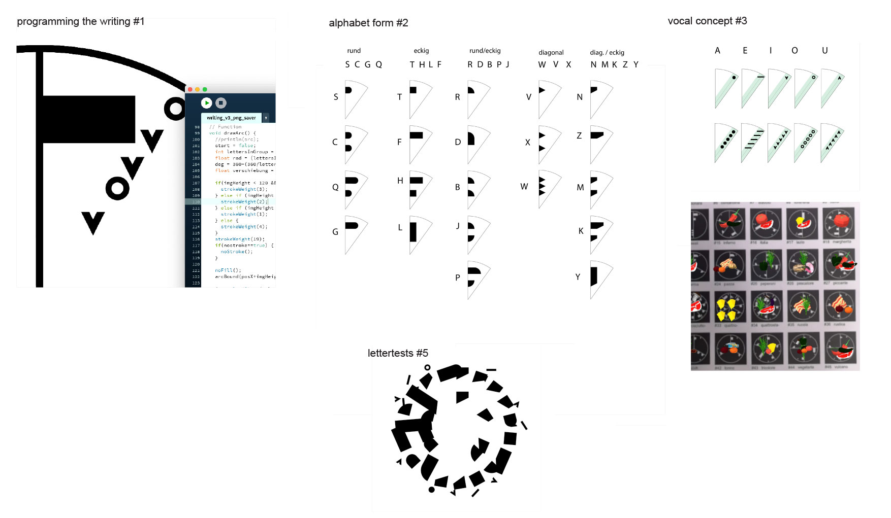
Unifying information design with typography, Som explores new ways of reading. But the project goes far beyond the creation of a set of symbols. By modifying the letter forms of the Latin alphabet, he develops a modular abstract language system. This systematic method makes it possible to create a circular visual representation of any word. Each word is depicted as a circular unit with defined information “slices.” The linearity, typical in traditional reading, is replaced by the circular—similar to the way we read a clock.
From a design perspective, Som has created a cohesive, precise system, integrating programming and augmented reality perfectly into a graphic visualization. The jury was particularly impressed by the clarity and abstraction in the communication design student’s visual scheme. The individual symbols are not just derivations from the Latin alphabet. We must understand the distinction in size between consonants and vowels, for example, in order to read them. “Circular Font System” is outstanding for its analytic visual concept, the clear exploration of the symbolic elements, and its innovative, transdisciplinary approach.
Artist Statement
My intention was to create graphic symbols that hold information. In my symbols, the information is a word that itself can contain more information. Every symbol is created with a circular font system that arranges every combination of abstract letterforms in a circle. To illustrate this and bring to it a context, I used the font to generate 45 pizza name symbols. As the round shape already fits the visual of a pizza, it also contains the name in its construction. In the next level the name itself also holds information that describes the pizza. To illustrate this I used Ar.js, which adds another dimension to the symbols, showing the information of the word, too. This can be explored by opening the website kajetansom.ch/pizza on a smartphone and holding it over the symbols. For this a black background is needed, which is why I added two forms of each symbol.
Kajetan Som
Kajetan Som is studying visual communication at the HGK FHNW in Basel, Switzerland. His focus lies in alternative media and typography. As a former programmer, he tries to include digital features and aspects in his projects in addition to traditional graphic design.
Process


